


Latest News
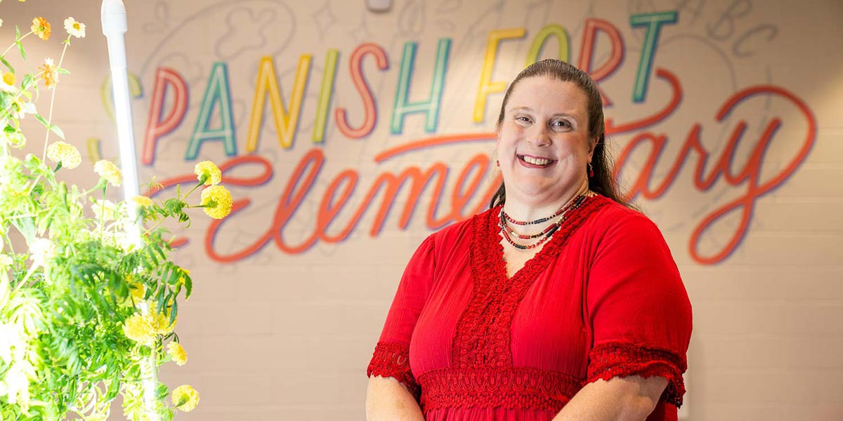 South Alumna Named 2026-2027 Alabama Teacher of the Year
Thursday - June 4, 2026
There was a time when Elizabeth Von Hofe told her father, a career educator, that she would never follow in his footsteps.
Read more
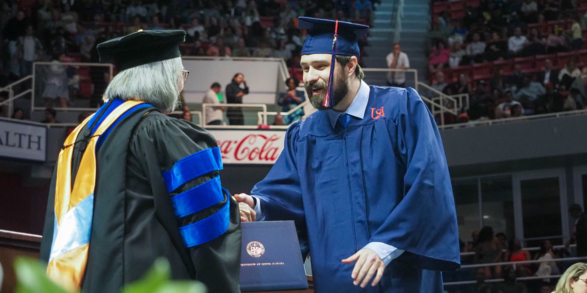 College of Education and Professional Studies Celebrates Spring 2026 Graduates
Thursday - May 14, 2026
Approximately 272 students are expected to earn degrees and credentials from the College of Education and Professional Studies this spring, including 171 undergraduate students and 101 graduate students.
Read more
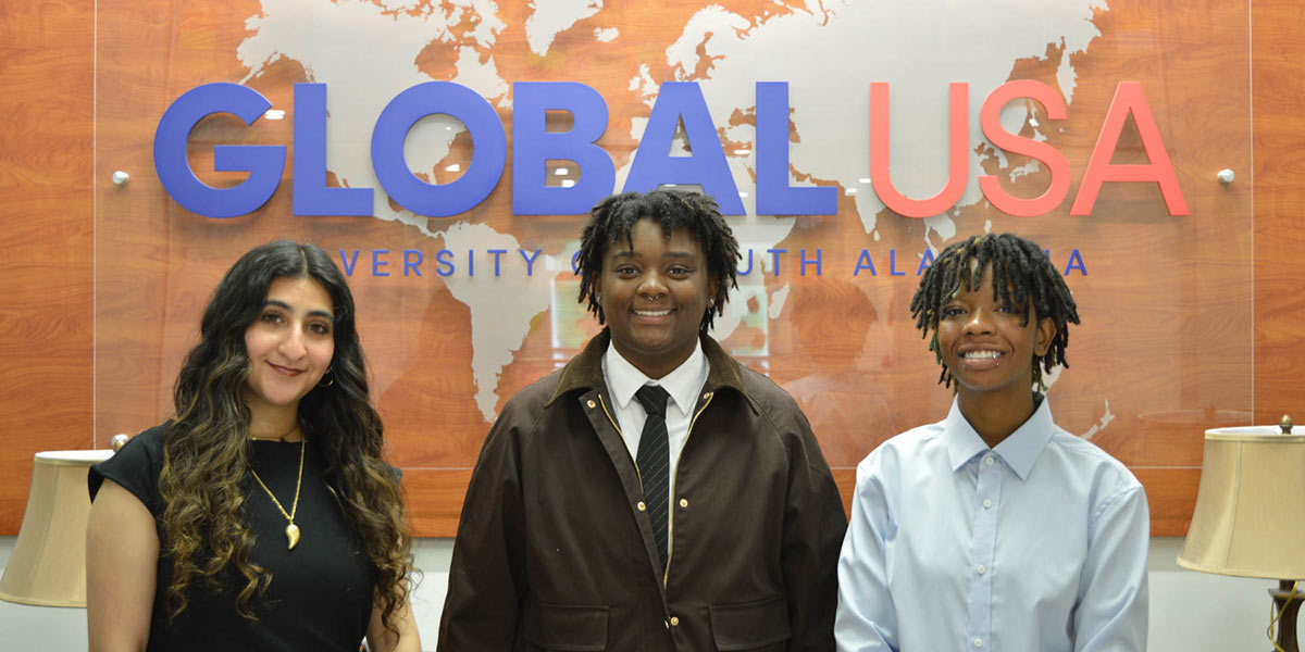 USA Students Earn Gilman Scholarships to Study Abroad
Thursday - May 14, 2026
Three University of South Alabama students earn Gilman Scholarships to study abroad. From left, Molan Abdallah will study in Spain this summer, Jordan Simmons will study in Greece this summer and Krys Freeman will study in Thailand next spring.
Read more