Brand Refresh
Below you will find key features of the University of South Alabama's brand refresh. More comprehensive guidelines can be found here. Use this link to access the toolkit for brand assets.
Brand Positioning
With a name that has become synonymous with excellence along the Gulf Coast, the University
of South Alabama leads the way by taking deliberate action to engage, educate and advance.
Brand Voice and Tone
Genuine: Sincere in our words and actions.
Friendly: Warm and welcoming in a uniquely Southern way.
Welcoming: Embracing all the members of our community and a spirit of togetherness.
Proud: Exuding courage and finding confidence.
Spirited: Unabashed to be a Jaguar.
Resourceful: Determined and steadfast in setting our own course.
Colors
USA Red (Pantone 193), USA Blue (Pantone 281) and USA White are our primary colors. Our secondary color palette includes new, fresh options to choose from.

USA Blue
PMS 281
CMYK: 100/85/5/36
RGB 0/32/91
HEX 00205B

USA Red
PMS 193
CMYK: 2/99/62/11
RGB 191/13/62
HEX BF0D3E

USA White
CMYK: 0/0/0/0
RGB: 255/255/255
Hex: FFFFFF

Mobile Bay Blue
Pantone 318
CMYK 39/0/9/0
RGB 136/219/223
HEX 88DBDF

Pathfinder Yellow
PMS 2281
CMYK 22/5/74/0
RGB 206/213/104
HEX CED568

Frontier Green
PMS 5753
CMYK 60/42/89/28
RGB 94/103/56
HEX 5E6738

Horizon Orange
PMS 1235
CMYK 0/35/100/0
RGB 255/175/2
HEX FF6720

Commencement Gold
Pantone 2010
CMYK 0/27/100/0
RGB 255/173/0
HEX FFAD00

Jag Spot Black
CMYK 0/0/0/100
RGB 0/0/0
HEX 000000
New Fonts
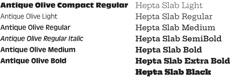
Antique Olive and Hepta Slab are available for free through Adobe Creative Cloud. Hepta Slab may also be found for free in Google fonts. Antique Olive can be purchased at MyFonts.com.

University of South Alabama Logo
The University logo has not changed and should be used where appropriate. Unit IDs
are also acceptable on collateral and apparel or specialty items. These logos can be found in the toolkit or can be downloaded here.


Ready South Go Logo
There are two lockups for Ready South Go (horizontal and stacked) in several different colorways. These logos can be found in the toolkit or can be downloaded here.


Legacy Fonts
There are some cases where Sofia and Surveyor are still acceptable for use. Building signage, for example, will not
change, so it would be appropriate to use one of these legacy fonts. In addition,
we will carry over another font, Cervo, for use in branding. The bold, condensed sans serif replaces United Sans as a legacy font and can be purchased
here. United Sans should no longer be used.

