

From Reporting to Insight: Transforming Business Data Into Business Success
Posted on November 29, 2021 by Boulder Insight
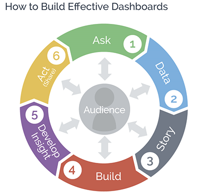
- Any successful data visualization project starts with an Ask: what are the ongoing questions leaders have about their business?
- Business Analysts know how to find, connect, and translate Data into a visually compelling dashboard structure.
- A thoughtfully designed dashboard clearly illustrates the Story the data is telling.
- Often, an initial Build of a dashboard shows unexpected relationships, outliers, and trends that can inspire
further questions and analysis, encouraging the exploration of new ideas.
- That’s how Business Analysts help company leaders gain and communicate Insight in an optimal and engaging manner.
- Once insight is attained and communicated, it is far easier for leaders and those they rely upon to Act upon those insights. A visually compelling dashboard makes it far easier to share insights and increase understanding behind a specific action, which makes a team, workforce, or oversight board far more efficient and engaged.
You can see examples of compelling dashboard templates and a short video where Chris Cox describes building dashboards with ‘WOW’ factor at https://www.tableautemplates.com/, a Boulder Insight resource for the data visualization community.
University of South Alabama alumnus Brian Mooneyham (‘97) spoke with 2021 SABRE Analytics Summit attendees about the power that great data visualization has to transform an organization’s operations and create opportunities for success. Joining Brian for his From Reporting to Insight presentation and additional conversations were Chris Cox and Kevin Swearingen of Boulder Insight Group.
Chris (Founder, Principal, Head of Technology and Product Development) and Kevin (Director of UI/UX Design, Data Visualization Scientist) head up the consultancy think-tank dedicated to teaching people how to analyze and present data in a way that helps leaders make informed decisions. Boulder Insight clients include Fortune 500 companies, government agencies, SMBs across multiple industries, and nonprofit organizations.
Full utilization of data visualization tools lags adoption as business leaders continue to ask for data to be gathered and presented using traditional spreadsheets. Regardless of size or industry, almost every business generates data that rapidly fills thousands of fields in an Excel doc or .csv file. But according to Boulder Insight, data can’t tell a story when confined to columns and rows. Even fancy formulaic footwork and filters fail to help people easily see and share critical information that informs decision-making.
The use of Data Visualization tools and best practices allows Business Analysts to discover and relay the stories hidden within an organization’s data, empowering leaders with insight to take data-driven actions. Brian, Chris, and Kevin spoke with conference attendees and Mitchell College of Business doctoral students about the proven potential of data visualization to increase business success, as well as the importance of thoughtful, human centered design to best tell data stories.
For Boulder Insight a crucial starting point for any business analytics project is turning a Data Task into a Data Ask. A Data Task is a basic demand for information, such as: “What are our sales by product type and customer?” Both Brian and the team at Boulder Insight teach Business Analysts how to conduct a Data Ask conversation to get context on what leaders want and need to see – to get to the “why” behind the “what” in an attempt to gain true insight. (See graphic and link at the end of the article for additional detail.)
Asking executives about long-term business goals and what they consider key performance indicators (KPIs) goes a long way in helping a Business Analyst design a data visualization dashboard that delivers useful, actionable insight. For example, it’s probably safe to assume that business leaders would want to spend less while making more money. A few asks about that initial task (“What are our sales by product type and customer?”) quickly reveals the question the executive really needs answered to determine how to achieve that goal, “Which are our most and least profitable products and customers?”
By building a dashboard in real-time in front of conference attendees, Chris, Brian, and Kevin visually demonstrated the increased value and impact of turning a Data Task into a Data Ask. To do this they used Tableau – a popular data visualization platform that allows expert users to create customized dashboards that reflect an organization's goals, performance, and brand, while communicating the data story around the Ask.
TASK RESULT
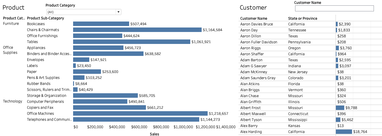
What are our sales by product type and customer?
ASK RESULT
Which are our most and least profitable products and customers?
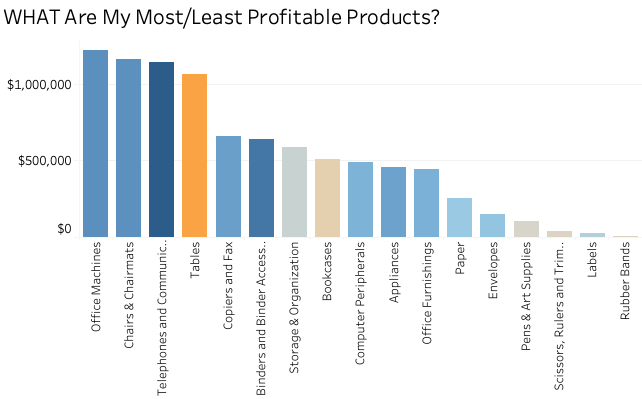
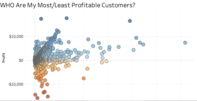
The graphics in this article don’t show you what attendees could see live. Each visual representation of a data point – a bar, a name, a date, or a circle – is interactive. Users can click on or hover over one or a group of items to access more detailed information or maneuver the data to dive into deeper understanding.
According to Boulder Insight, no one should have to go back to school to achieve a Data Scientist-level of expertise to understand and maximize the potential of their organization’s data. Business Analysts have that expertise in data analysis and should be able to leverage tools such as Tableau to design accessible, visually compelling dashboards that best help leaders gain important insights.
Designing a successful data visualization dashboard requires knowing a bit about Human Centered Design, a UI/UX philosophy that Boulder Insight uses for all of their work. It isn’t easy to understand a data story while scrolling through a spreadsheet consisting of thousands of rows. For example, as Kevin pointed out, in most western countries people read from left to right and respond to shapes and colors that mean something to us, such as black or green for profit, red for loss, or a company's colors for brand consistency and resonance. Utilizing this understanding of how our brains function in dashboard design allows for more digestible data story creation and an improved ability to make insightful decisions.
A Business Analyst needs to ask questions to learn the core information that dashboard users (i.e. decision makers) want to see or be alerted to. Following UI/UX best practices means ensuring KPIs are presented clearly and that the most important information is readily available. That means also choosing the most effective charts to display data, while organizing them in a format that leverages how our brains are already conditioned to process information, by using colors and shapes that command attention and engagement.
Brian, Chris, and Kevin demonstrated how Data can be a powerful communication tool when leveraged through a compelling visual dashboard and shared thoughtfully. Good Business Analysts know the best data visualization tools to use for their organization. Great Business Analysts know the best questions to ask before using those tools, allowing business leaders to leverage data into transformative business insights and take decisive actions.
Brian Mooneyham (Class of ‘97) Brian Mooneyham is a Vice President of Data Strategy. Chris Cox is the Principal and Head of Technology and Product Development at Boulder Insight, a business consultancy think-tank founded in 2008. Kevin Swearingen is an award-winning Director of UX/UI Design at Boulder Insight and a Data Visualization Scientist.